 Ronald Aug . March 20
Thumbnail Designers
Creating Custom Thumbnails with YouTube Studio


 Think Media
Custom thumbnails play an essential role in attracting viewers and increasing your video's click-through rate (CTR) on YouTube. According to YouTube, 90% of the best-performing videos have custom thumbnails. In this section, we will discuss the best practices for creating effective custom thumbnails with YouTube Studio.
A high-quality image makes the thumbnail stand out, even at smaller sizes. Thumbnails should have a resolution of 1280x720 pixels, with a minimum width of 640 pixels, and the image should be uploaded in either JPG, GIF, or PNG formats. YouTube supports maximum file sizes of 2MB.
Capture the Essence of the Video Content
Create a thumbnail that accurately represents the video content. Misleading or unrelated thumbnails can result in low watch time, high bounce rate, and can even lead to YouTube penalties.
Use Visual Consistency
Visual consistency in your thumbnails makes it easy for viewers to identify your content at a glance. If you have a distinct color scheme, logo, or font style, incorporate those elements in your thumbnails to create a consistent brand identity.
Text and Typography
In some cases, adding text to the thumbnail can provide context or emphasize the video topic. Keep these tips in mind when using text:
- Use large, bold typography that is easy to read even at small sizes.
- Use contrasting colors for text and background.
- Keep the text simple and concise. Avoid lengthy and complicated phrases.
Faces and Emotions
Including faces in thumbnails can evoke emotions and create a connection with the viewer. Expressive faces can drive curiosity and increase clicks. But make sure that the faces align with the video content and convey the appropriate emotion.
Split Testing
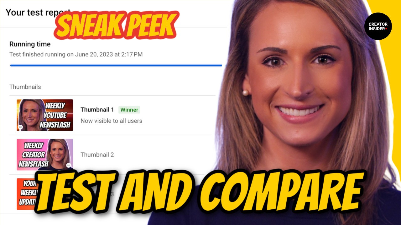
Running split tests with different thumbnail designs helps you discover which design works best for your specific audience. Use YouTube's A/B testing feature to test thumbnail variations and optimize your click-through rates.
Don't Forget Accessibility
Ensure your custom thumbnails are accessible for all users, including those who use screen readers. Add descriptive text in the video metadata to facilitate this.
Analyze and Optimize
Periodically analyze your channel's statistics, particularly CTR and watch time. This can help you identify if your thumbnail practices are effective or if changes should be made. YouTube Analytics can provide valuable insights about these metrics.
To learn more about how to optimize your thumbnails for creating more engaging content, consider checking out how to increase CTR on YouTube.
By following the best practices discussed above, you can create custom thumbnails with YouTube Studio that will stand out from the competition, attract more viewers, and ultimately increase your video's performance. Remember that an effective custom thumbnail is a powerful tool in the ever-competitive landscape of YouTube.
Creating Custom Thumbnails with YouTube Studio
Enabling Custom Thumbnails in YouTube Studio
Custom thumbnails make your videos stand out and drive more clicks by showcasing the most engaging aspects of your content. According to YouTube, having a custom thumbnail can boost your video's click-through rate (CTR) by up to 154% . In this section, you will learn how to enable custom thumbnails in YouTube Studio.
- 90% of the best-performing videos on YouTube have custom thumbnails .
- Custom thumbnails can improve your CTR by up to 154% .
Enabling Custom Thumbnails
To enable custom thumbnails in your YouTube Studio, follow these steps:
- Log in to your YouTube Studio.
- Click on "Settings" in the left sidebar menu.
- Go to the "Channel" tab and click on "Upload defaults."
- Under the "Visibility and thumbnail" section, change the "Thumbnail" setting to "Custom."
- Save your changes.
Now you can upload custom thumbnails for all of your videos. When uploading a new video, click on the "Upload thumbnail" button to add your custom thumbnail. For existing videos, you can also change the thumbnail by clicking on the "Edit video" button and uploading a new thumbnail.
-
Do make your thumbnail visually appealing and relevant to your video's content.
-
Do use high-quality images with bright colors and clear typography.
-
Do keep the thumbnail size under 2MB and use a 16:9 aspect ratio .
-
Do use a thumbnail designer if you need help creating professional-quality thumbnails.
-
Don't use misleading or clickbait thumbnails. This may lead to lower watch time, lower retention rate, and negative user experience.
-
Don't violate YouTube's guidelines or policies. Avoid using explicit, violent, or offensive images in your thumbnails.
Free and Paid Thumbnail Resources
If you are looking to create custom thumbnails for your videos, these popular and effective tools exist:
- Canva - Canva is a free graphic design platform that offers templates and tools to create custom thumbnails.
- Snappa - Snappa is an online graphic design tool that allows you to create custom thumbnails quickly and easily. They have a free and paid version.
- PicMonkey - PicMonkey is a photo editing and design platform with built-in thumbnail templates. They offer a paid version with access to premium features.
Design Principles and Aesthetics for Eye-catching Thumbnails

 Tyler Fleischman
Color Theory and how it influences click-through rates
Overview
Color Psychology
Colors have the power to evoke emotions, making it crucial to consider color psychology when designing thumbnails. Here's a brief overview of several colors and the feelings they can invoke:
- Red: Passion, energy, urgency
- Blue: Trust, reliability, calmness
- Green: Growth, health, nature
- Yellow: Happiness, optimism, attention
- Orange: Enthusiasm, creativity, warmth
- Purple: Luxury, wisdom, mystery
Remember that different shades and tones of the same color can communicate different emotions, so experiment with a color palette to evoke the desired feelings.
The Color Wheel and Color Harmony
The color wheel, which contains primary, secondary, and tertiary colors, serves as the basis for color harmony. Thumbnail creators can use the following color schemes to create appealing designs:
- Monochromatic: Various shades, tones, or tints of a single color
- Analogous: Colors adjacent to each other on the color wheel
- Complementary: Colors opposite each other on the color wheel
- Split-complementary: One color and the two colors adjacent to its complement
- Triadic: Three equidistant colors on the color wheel
- Tetradic: Four colors forming a rectangle on the color wheel
Keep in mind that the right color harmony helps avoid visual clutter, ensuring your thumbnail remains easy to understand and visually appealing.
Typography and Color
Fonts and text colors play a significant role in conveying your video's message. Try the following tips regarding font color:
-
Use high contrast colors for text and background, ensuring legibility
-
Choose no more than two or three font colors to avoid cluttering the design
-
Tie the text colors to the color scheme used for the thumbnail background and images
-
DO create a consistent color scheme across your thumbnails, promoting brand recognition
-
DO use contrasting colors to ensure that text, icons, and essential elements stand out
-
DON'T abuse color saturation, leading to a visually overwhelming design
Color Contrast and Accessibility
To guarantee accessibility, consider people with color vision deficiencies when designing your thumbnails:
- Ensure sufficient contrast between text and background for readability
- Test your design with colorblind accessibility tools, such as the Color Oracle
YouTube's Dark Mode and Light Mode
YouTube offers both Light Mode and Dark Mode, and viewers might use either option. Consider testing your designs in both settings to ensure they remain visually appealing and easily noticeable.
By employing color theory and paying attention to design principles and aesthetics, creators can design eye-catching thumbnails that positively influence click-through rates. For further resources on YouTube content creation, explore these online courses and educational resources to improve your skills on how to make YouTube videos.
Composition and Visual Hierarchy
Composition and visual hierarchy are essential elements of designing eye-catching YouTube thumbnails to draw viewers into watching your content. Thumbnails can make or break your video’s click-through rate (CTR), influencing impressions and ultimately playing a significant role in the success of your channel. In this section, we will discuss design principles and aesthetics to create effective YouTube thumbnails.
Key Principles & Guidelines
Simplicity
Keep your thumbnail design simple. Less is more; avoid cluttered backgrounds and graphics that make it difficult for users to understand the subject of your video. Stick to clean, bold visuals that are easy to comprehend.
Readability
Well-designed thumbnails need to be easily readable on a variety of screen sizes and devices. Choose fonts and font sizes appropriate for the small preview images while maintaining clarity and legibility.
Emphasis
Draw attention to the most important elements of your thumbnail. This can be done through size, color, contrast, or other visual cues. These focal points should convey the video's main subject or theme.
Consistency
Develop a consistent thumbnail style that represents your brand and makes it easy for users to identify your content quickly. This can include consistent colors, fonts, or layout elements.
Emotional connection
Evoke emotion through visual elements to create a connection with your audience. This can be achieved through facial expressions, eye contact, relevant imagery, or text with emotional appeal.
Use of data
Utilize CTR data, A/B testing, and audience feedback to make informed decisions about your thumbnail designs. Analyze successful thumbnails from your channel and similar content creators to learn what works well.
Common Mistakes to Avoid
- Overloading your thumbnail with text
- Using low-quality images or graphics
- Choosing colors that blend in with YouTube's interface
- Ignoring the importance of thumbnail branding
- Using clickbait or misleading imagery
To better understand these principles, let's look at some successful thumbnail designs:
Tools & Resources
There are numerous tools and resources available for creating thumbnails ranging from beginner-friendly to advanced software. Some popular options include:
- Canva
- Adobe Photoshop
- Fotor
- PicMonkey
- GIMP
To further improve your YouTube thumbnail designs, consider checking out online courses and educational resources on how to make YouTube videos, as well as tools and services for creators.
By understanding and applying compositional and visual hierarchy principles, you can create compelling YouTube thumbnails that capture viewers' attention and positively impact your channel's growth. Stay focused on simplicity, readability, and consistency while utilizing data-driven decisions to refine and improve your designs.
Design Principles and Aesthetics for Eye-catching Thumbnails
Typography in Thumbnail Design
Importance of Typography in Thumbnails
-
Enhanced visual appeal: The right typography makes thumbnails more visually appealing, thus enticing users to click on the video.
-
Conveys the message: Typography can give valuable information and context about the video content.
-
Stands out from competition: A striking and well-designed thumbnail with proper typography could make your video grab the attention of users, whereas a poorly designed thumbnail might lead to fewer views.
-
Higher click-through rates (CTRs): Several YouTube optimization studies have suggested that attractive thumbnails with appropriate typography can lead to higher CTRs.
Typography Best Practices
-
Choose a Visible and Legible Typeface: Consider using a typeface that is easy to read and stands out from the thumbnail's background. Sans-serif fonts like Arial, Helvetica, or Futura are popular choices that are easy to read.
-
Opt for Bold Fonts: A bold font can make your text more visible, particularly when it comes time to scale down your thumbnail image for mobile devices or smaller screens.
-
Use Contrasting Colors: Ensure that the text color contrasts with the background to enhance readability. Avoid using colors that blend into the background and make it difficult for viewers to read the text.
-
Consider Text Size: Make sure the text is large enough to be read when the thumbnail is scaled down. If the text size is too small, viewers on mobile devices might not be able to read it clearly.
-
Limit Text Quantity: Too much text can clutter the thumbnail and make it difficult to read. Try to keep it brief while conveying the video's message.
-
Simple, Consistent Style: Keep the typography in your thumbnails consistent across your channel for a more recognizable and cohesive look. Avoid excessive variation in fonts, sizes, and colors.
The left thumbnail exhibits better typography, with a clear, bold font, contrasting colors, and concise text. On the contrary, the right thumbnail employs an illegible text size and lacks sufficient contrast between text and background colors.
-
Do: Use clean and legible fonts, maintain proper text hierarchy, and choose contrasting text and background colors.
-
Don't: Overuse text, rely on overly stylized fonts, or use poor color combinations.
To further enhance your YouTube-related knowledge and skills, consider exploring these how to make YouTube videos resources for additional tips and techniques.
DIY Thumbnail Design Tips for Creators


 Channel Makers
Balancing Creativity with Efficiency
Thumbnails are the first impression that your content gives to potential viewers. They can make or break your video's success on YouTube. However, striking the perfect balance between creativity and efficiency in DIY thumbnail design is crucial for YouTube creators. In this section, we will cover the tips that can help you create eye-catching and optimized thumbnails without sacrificing too much time or resources.
Use templates for consistent branding
Using templates can save you time by providing you with a set of pre-built elements for your thumbnails like fonts, colors, and layouts. Moreover, templates enable consistent branding across your content, which is essential for viewer recognition and building a loyal audience. Many best tools for YouTube creators offer thumbnail template options.
Pick the right color scheme and font
Colors play a significant role in capturing the attention of viewers. Research shows that using high contrasting colors can lead to a 180% increase in CTR. To be efficient, restrict your color palette, and use bold, easily readable fonts that align with your channel's theme and branding.
Prioritize visual hierarchy
In thumbnail design, it's essential to arrange your design elements in an order that conveys their relative importance in the hierarchy. Focus on the most critical elements, like the title and primary visual, and relegate secondary visuals to the background or corners.
Keep it simple
Overcomplicating your thumbnail can clutter your design and confuse viewers. Use a minimalist approach by only including essential elements like your channel logo, title, and a single captivating image that represents the content well.
Analyze and iterate
Lastly, don't forget to track your video's performance using YouTube Analytics. Monitor your CTR and make necessary modifications to your DIY thumbnail design based on the response it gets. Remember that iterating is a part of a successful creative process.
By following these tips and striking the perfect balance between creativity and efficiency, you can create captivating thumbnails that make your YouTube content stand out. In the end, the key is to understand your target audience and create a thumbnail design that works best for them.
For more information about creating content for YouTube, check out our guide on how to make YouTube videos.
Keeping up with Design Trends and Inspiration
As a YouTube creator, it's crucial to stay up-to-date with design trends and find inspiration for your thumbnail designs. In this section, we will guide you through some effective ways to keep up with design trends and find inspiration for DIY thumbnail designs.
- 75% of YouTube users are more likely to click on a video with an attractive thumbnail
- A well-designed thumbnail is crucial in increasing your click-through rate (CTR) by 154%
- 90% of the best-performing videos on YouTube have custom thumbnails
Top Thumbnail Design Trends
- Bold typography
- Striking color combinations
- Use of emojis and icons
- Minimalist design
- Text overlay on images
Popular Tools for Thumbnail Design
- Canva
- Adobe Photoshop
- GIMP
- PicMonkey
- Fotor
Thumbnail Best Practices
-
Use high-resolution images
-
Add contrasting text for improved readability
-
Keep the design consistent with your brand
-
Test multiple thumbnail designs
-
Find inspiration from top YouTube creators
Do
- Research current design trends
- Analyze the thumbnails of successful YouTube creators
- Make your thumbnail relevant to your video content
- Use bold colors and typography
- Keep the design clean and uncluttered
Don't
-
Use misleading images or clickbait tactics
-
Overwhelm the design with too much text or too many elements
-
Ignore your brand's aesthetic and design language
-
Neglect to test different thumbnail designs for better results
Keeping Up with Design Trends and Finding Inspiration
Websites and Newsletters
Social Media
Follow top YouTube creators, design influencers, and design studios on social media platforms like Instagram, Pinterest, and Behance.
Online Courses and Educational Resources
Design Blogs and YouTube Channels
Subscribe to design-centric YouTube channels and read blogs on design trends and inspiration regularly.
By incorporating the above tips and ideas into your YouTube thumbnail design process, you will stay updated with design trends and create a visually appealing thumbnail that will ultimately drive more views and engagement.
YouTube DIY Thumbnail Design Tips for Creators
YouTube Learning the basics of design software
Thumbnails act as a virtual cover for your YouTube videos, which makes creating attractive and informative thumbnails a crucial part of gaining viewership. A study by Backlinko revealed that 90% of top-performing videos on YouTube have custom thumbnails.
Learning the basics of design software is the first step towards creating professional-looking thumbnails. This section will cover the following key points:
** Types of design software**
There are numerous design software options available for creating high-quality thumbnails. Some popular choices include:
- Adobe Photoshop (paid)
- Canva (free and paid)
- Gimp (free)
- PicMonkey (free and paid)
- Fotor (free and paid)
** Basic design principles**
Follow these do's and don'ts to ensure that your custom YouTube thumbnails are eye-catching and effective:
- Do: Use bold, contrasting colors to make your thumbnail stand out.
- Do: Use text sparingly and make it large enough to read on small screens.
- Do: Showcase the main subject or topic of the video in the image.
- Don't: Use low-resolution images or templates.
- Don't: Clutter your thumbnail with too much text or too many elements.
- Don't: Use misleading visuals or clickbait tactics.
** Image dimensions and file formats**
Ensure that your YouTube thumbnails have the correct dimensions and file format:
- Thumbnail Size: 1280 x 720 pixels (with a minimum width of 640 pixels)
- Aspect Ratio: 16:9
- File Format: JPEG, PNG, BMP, or GIF
- File Size: No larger than 2 MB
** Using templates and tutorials**
When starting, using templates and tutorials could significantly speed up your learning process:
- Utilize design software with built-in templates designed specifically for YouTube thumbnails.
- Leverage YouTube channels or websites dedicated to helping creators learn such software, which often offer tutorials for specific design tasks.
** Saving and organizing thumbnail designs**
Creating a structured system for saving and organizing your thumbnail designs will make the process more efficient:
- Use descriptive file names for thumbnails or create separate folders for different video series or categories.
- Save your thumbnail design files in a dedicated folder to ensure easy access and to keep your computer organized.
Once you've mastered the basics of design software, you're on your way to consistently creating compelling and eye-catching thumbnails, increasing your video's click-through rate (CTR), and growing your YouTube channel.
Related resources:
Guidelines and Best Practices for YouTube Thumbnail Design


 Think Media
Guidelines and Best Practices for YouTube Thumbnail Design
Considering the context in search results and suggested videos
-
According to YouTube, 90% of top-performing videos have custom thumbnails [source].
-
Brafton found that featuring a high-quality, visually-engaging thumbnail can increase your click-through rate (CTR) by 154% [source].
Do's
-
Use high-resolution images: Always use images with a resolution of 1280 x 720 pixels, to ensure that your thumbnail looks clear and professional across various devices.
-
Optimize for mobile viewing: Considering that more than 70% of watch time on YouTube comes from mobile devices [source], make sure your thumbnail is easily viewable on small screens.
-
Showcase your brand: Include your logo or a consistent color scheme to make your videos easily identifiable in search results and suggested videos.
-
Use contrasting colors: Contrasting colors not only help your thumbnail stand out, but they also make the text and visuals more readable.
-
Ensure text readability: Use large fonts and limit the number of words on your thumbnail to make the text legible and easy to read.
-
Highlight the video's topic: Use visuals and text that accurately represent the content of your video, making it relevant and appealing to potential viewers.
-
Test different designs: Experiment with different thumbnail designs to find out what works best for your audience. Review your CTR statistics to measure your thumbnail's performance.
Don'ts
-
Avoid clickbait: Steer clear of using misleading images and text that do not accurately represent your video's content. This can damage your credibility and lead to a higher bounce rate.
-
Don't use low-quality images: Blurry or pixelated images can make your thumbnail look unprofessional, decreasing the likelihood of viewers clicking on your video.
-
Don't clutter your thumbnail: Keep your design simple and avoid overcrowding it with too many images or text elements.
-
Avoid using YouTube's auto-generated thumbnails: Custom designed thumbnails perform better and help your videos stand out among other search results and suggested videos.
-
Peter McKinnon's photography tutorials use crisp, high-quality images with consistent branding and contrasting colors that make the text stand out.
-
Tasty's cooking videos use eye-catching, appetizing food images with minimal text that instantly convey the video's topic.
-
Kurzgesagt's animated explainer videos use a consistent, clean design featuring their distinctive animation style and limited color palette for instant recognition.
To boost your YouTube thumbnail design skills, consider enrolling in a course on how to make YouTube videos or working with professional thumbnail designers. By following these guidelines and best practices, you can create thumbnails that effectively engage viewers and improve your video's performance on search results and suggested videos pages.
Consistency in Branding and Thumbnail Design
Importance of Consistency in Branding and Thumbnail Design
A study conducted by YouTube found that top-performing channels have 3x higher video impressions for thumbnails than bottom-performing channels. The same study also discovered that top-performing channels have 25% higher click-through rates (CTR) on their thumbnails. This showcases the significance of creating consistent and compelling thumbnails for your channel's success.
Some benefits of having a consistent branding and thumbnail design in your channel include:
-
Immediate Recognition: A unique and coherent design will help your thumbnails stand out and make viewers instantly recognize your content.
-
Professional Appearance: Maintaining consistency across your thumbnails gives your channel a polished and professional look, increasing trust and credibility.
-
Audience Retention: Consistent design can improve viewer retention rates by reinforcing your brand identity.
Best Practices for YouTube Thumbnail Design
Here are some best practices for designing effective YouTube thumbnails:
-
Design with Clarity: Ensure that your thumbnail is visible and readable even at small sizes (e.g., on mobile devices). Use high-contrast colors, large text, and simple images to make your design pop.
-
Optimize for CTR: A high CTR reflects the effectiveness of your thumbnail in attracting attention and driving viewers to click on your video. Use YouTube's algorithm to optimize thumbnails for higher CTR and increase impressions.
-
Incorporate Branding Elements: Your brand's logo, colors, typography, and style should be consistent across all thumbnails. This visual consistency reinforces your brand identity and helps viewers recognize your content immediately.
-
Use Faces and Emotions: Thumbnails featuring faces with expressive emotions have been proven to perform better^. Use images of people, especially close-ups that highlight emotions, to evoke curiosity and encourage clicks.
-
Avoid Clickbait: While tempting, using misleading or exaggerated images and text in your thumbnails can hurt your channel's reputation and viewer trust in the long run. Align your thumbnail content with the actual content of your video for better results.
-
MKBHD: MKBHD, a tech review channel, maintains a distinctive and consistent design language characterized by bold colors and clear product shots.
-
The Infographics Show: The Infographics Show's thumbnails have a recognizable style with the use of consistent color palettes, character illustrations, and large text.
-
Tasty: Tasty, a food content channel, leverages clear and enticing images of the featured dish, along with bold text and vibrant colors for a consistent design.
Thumbnail Design Tools and Resources
Creating eye-catching and consistent thumbnails doesn't require professional design skills. There are numerous resources and tools available online to help you create high-quality thumbnails, including thumbnail designers and editing software. Experimenting with different tools and exploring online courses on how to make YouTube videos can further enhance your thumbnail design skills.
Continuously Improve and Adapt Thumbnail Designs
Just like any aspect of your channel, your thumbnails should constantly evolve and improve. Monitor your channel analytics to identify which thumbnails perform well in terms of impressions and CTR, and use those insights to inform your future design choices. Engaging with your audience through feedback and surveys can also help you fine-tune your designs to better resonate with your viewers.
Guidelines and Best Practices for YouTube Thumbnail Design
Optimizing for Mobile Viewers
1. Keep it simple
Mobile screens are smaller than desktop screens, so it's essential to use a simple and minimalistic design that is easy to understand at a glance.
- Do: Use a clean and uncluttered design.
- Don't: Overload your thumbnail with text and images.
2. Bold and contrasting colors
Make your thumbnail stand out and grab the viewer's attention by using bold and contrasting colors.
- Do: Use bright and vibrant colors.
- Don't: Use dull colors that blend with the YouTube interface.
3. Readable text
If you choose to use text in your thumbnail, make sure it's easily readable on a small screen.
- Do: Use large and bold fonts.
- Don't: Use small or thin fonts that are hard to read.
4. Faces and emotions
Statistics show that thumbnails featuring faces and emotions tend to perform better than those without.
- Do: Include close-up shots of faces with expressive emotions.
- Don't: Use far away or unclear shots of faces.
5. High-quality image
A high-quality image is essential to make your thumbnail look professional and enticing to the viewer.
- Do: Use a crisp and clear image with good resolution.
- Don't: Use blurry or pixelated images.
To learn more about creating content for YouTube, check out our guide on how to make YouTube videos.
Tools and Resources
Don't forget to explore some of the best tools for YouTube creators to enhance and optimize your thumbnail designs for both desktop and mobile viewers.
Hiring a Freelance Thumbnail Designer What to Look For
- Aesthetics and Quality
- Relevance to YouTube and Thumbnail Design
- Range and Versatility
- Client Feedback and Testimonials
- Turnaround Time and Deadlines
- Familiarity with Copyright, Fair Use, and YouTube Guidelines
- Comparing Pricing and Services Offered

 Chadeveryday
Assessing a Designer's Portfolio and Experience when Hiring a Freelance Thumbnail Designer
When looking to hire a freelance thumbnail designer, it's essential to assess their portfolio and experience. This will ensure you find an individual who can help your YouTube channel stand out and grow. Consider the following factors when assessing a designer's portfolio and experience:
Aesthetics and Quality
- Consistency in design quality
- Attention to detail
- Proper use of typography, colors, and visual elements[^color]
Relevance to YouTube and Thumbnail Design
Verify that the designer has experience creating thumbnails specifically for YouTube. Aspects to consider include:
- Familiarity with YouTube thumbnail dimensions (1280x720 pixels)
- Good understanding of CTR optimization strategies
- Ability to design thumbnails that stand out on a variety of devices and in search results[^devices]
Range and Versatility
A designer with a versatile portfolio indicates that they can adapt to different styles and cater to your specific needs. Check whether the designer has experience with:
- Thumbnails for different YouTube niches
- Creating designs for multiple formats (such as YouTube Shorts)
- Incorporating various design elements, colors, and themes[^range]
Client Feedback and Testimonials
Look for reviews or testimonials provided by the designer's past clients. Positive feedback from other YouTube creators will act as social proof of the designer's skills and reliability. Assess client feedback in terms of:
- Overall satisfaction
- Timeliness and communication
- Ability to implement feedback[^testimonials]
Turnaround Time and Deadlines
While high-quality work is crucial, it's also essential that your thumbnail designer can deliver in a timely manner. Discuss expected turnaround time and your scheduling requirements with the designer to ensure they fit your needs[^turnaround].
Familiarity with Copyright, Fair Use, and YouTube Guidelines
To avoid any potential copyright issues, ensure the designer understands the rules and regulations surrounding copyright laws for YouTube thumbnails. This includes respecting YouTube's content guidelines and using copyright-free images, fonts, and materials[^copyright].
When assessing a freelance thumbnail designer's portfolio and experience, prioritize the factors most relevant to your YouTube channel's success. An experienced designer can greatly contribute to the growth of your channel, helping you increase views, engagement, and subscribers.
To learn more about different elements of YouTube content creation, check out our guide on how to make YouTube videos.
Hiring a Freelance Thumbnail Designer What to Look For
Comparing Pricing and Services Offered
- According to a survey of YouTube creators, 34.8% of respondents spent between $2-$5 per thumbnail, followed by 33.1% spending between $5-$10 per thumbnail.
Source: CreatorHype
-
Price: $5 per thumbnail
-
Included services: Custom design, high-quality images, and unlimited revisions
-
Delivery time: 24 hours
-
Price: $10 per thumbnail
-
Included services: Custom design, high-quality images, unlimited revisions, and source file (Photoshop or Illustrator file)
-
Delivery time: 48 hours
Do's
- Research multiple designers and compare their pricing and services offered.
- Check the portfolio of each designer to get an idea of their design style.
- Read reviews from previous clients to evaluate the quality of their work.
- Consider the turnaround time of each designer.
- Assess the available budget for thumbnails before choosing a designer.
Don'ts
- Don't choose a designer based solely on price. The quality of their work should also be taken into consideration.
- Don't be afraid to negotiate the price or request additional services if needed.
- Don't forget to consider the potential impact of a high-quality thumbnail on your video's performance, particularly CTR (Click-Through Rate).
Chart Comparing Freelance Thumbnail Designers
| Criteria | Designer A | Designer B | Designer C |
|---|---|---|---|
| Price per Thumbnail | $5 | $10 | $7 |
| Design Style | Flat | 3D | Minimalist |
| Revisions | Unlimited | 3 | 5 |
| Delivery Time | 24 hours | 48 hours | 72 hours |
| Source File | No | Yes | Yes |
By comparing pricing and the services offered by different freelance thumbnail designers, you can make an informed decision to choose the right designer for your needs. Remember, investing in a high-quality thumbnail has the potential to improve your video's performance and help you grow your YouTube channel.
Hiring a Freelance Thumbnail Designer What to Look For
Establishing clear communication and expectations
Why clear communication is important
In any collaboration, especially one involving creative work, misunderstandings can easily arise due to unclear communication. This may lead to poor execution of your ideas or the need for numerous revisions, which is both time-consuming and frustrating for both parties. By clearly articulating your expectations, you can save time and ensure that the final product aligns with your vision.
Setting expectations
It's essential to discuss your creative ideas, objectives, and any specific requirements up front before your designer begins working. This includes providing them with any necessary assets (such as logos, images, or branding elements), discussing the look and feel you want for your thumbnails, and specifying any particular styles, colors, or fonts.
Here are a few tips to help you set clear expectations:
- Be specific: Describe what elements you want to see in your thumbnail, such as the level of detail, use of text, and color palette.
- Outline the timeline: Set reasonable deadlines for your designer to complete the task and inform them about any specific dates or milestones.
Do's and Don'ts of communication
- Do provide constructive feedback to help your designer improve upon their work.
- Do use concise language to state your ideas and expectations clearly.
- Don't use vague or ambiguous language that may leave room for misinterpretation.
- Don't micromanage your designer as it may hinder creativity and result in lower-quality work.
Tools and resources for communication
Utilize tools and platforms that facilitate effective collaboration and communication between you and your designer. Platforms like Trello and Asana can help you organize tasks, set deadlines, and track progress, while email, Slack, or Discord can be used for direct communication.
Collaborating with Your Thumbnail Designer
Learn how to effectively collaborate with a professional thumbnail designer to create eye-catching and engaging YouTube thumbnails. This guide provides insights into different aspects of thumbnail design communication, including conveying your vision, providing constructive feedback, and more.
- According to YouTube, 90% of the best-performing videos on the platform have custom thumbnails .
- YouTube users upload over 500 hours of video content every minute , making it essential for creators to craft attention-grabbing thumbnails to stand out from the crowd.
- High-quality thumbnails can result in a higher click-through rate (CTR) and increased viewership.
Conveying Your Vision
- Clearly articulate your video's theme and topic: Brief your designer on the subject matter, target audience, and tone of your content, enabling them to create thumbnails that effectively communicate your message.
Providing Constructive Feedback
- Be specific: Describe which aspects of the design need improvement and suggest revisions.
- Be respectful and tactful: Use positive language and compliment successful design elements while addressing areas that need work.
- Offer revisions in a timely manner: Quick feedback allows your designer to make changes while maintaining the project's momentum.
Dos:
- Use appealing visuals that are eye-catching and relevant to your content.
- Include bold typography and readable fonts.
- Opt for high-contrast colors that stand out against the YouTube interface.
- Ensure your thumbnail is easily readable on all screen sizes.
Don'ts:
- Overload your thumbnail with visual elements, making it cluttered and confusing.
- Use low-quality or pixelated images.
- Rely on stock images or generic visuals that may not effectively represent your content.
- Mismatch the thumbnail's design with your video content, leading to viewer disappointment and potentially decreased watch time.
Learning from the Best
One way to optimize your thumbnail collaboration with your designer is by studying successful YouTube channels and analyzing their thumbnail design choices. Check out the best channels, websites, and newsletters for YouTube creator news to stay current on what's working for top creators.
Wrapping up
Collaborating with a professional thumbnail designer improves the odds of your videos standing out on YouTube. By clearly communicating your vision, providing constructive feedback, and learning from the best, you can create impactful thumbnails that draw viewers to your channel.
Evaluating a Thumbnail Designer's Portfolio
A well-designed thumbnail can significantly impact the success of your YouTube channel. In this section, we will guide you through the process of evaluating a thumbnail designer's portfolio to help you hire the right professional for your needs.
Assess the designer's style and adaptability
It's essential to determine if the designer's style aligns with your channel's overall branding and target audience. Browse through their portfolio and look for:
- Consistency in quality and style.
- Evidence of attention to detail, such as typography, color schemes, and composition.
Analyze their genre-specific work
- Gaming channels
- Tech channels
- Lifestyle or beauty channels
- Education or tutorial channels
Review client testimonials and case studies
Client feedback can provide valuable insight into a designer's work ethic, communication skills, and ability to meet deadlines. Look for:
- Testimonials directly from the designer's website or social media.
- Case studies outlining successful projects to showcase their problem-solving skills.
Analyze key metrics of their past work
Stats from past projects can help you gauge the designer's success in improving CTR (click-through rate). Search for:
- Before and after comparisons of thumbnails leading to increased views and engagement.
- Testimonials showcasing measurable growth in CTR due to improved thumbnails.
Assess their knowledge of YouTube best practices
- Compliance with YouTube's thumbnail guidelines.
- Incorporation of popular design trends, such as bold text or hand-drawn elements.
- Effective use of keywords and phrases in thumbnail text.
Do:
- Consider various factors like style, experience, and proven success instead of just aesthetics.
- Have a clear vision of what you want in your thumbnail designs and communicate it to the designer.
Don't:
- Automatically dismiss designers if you don't love every thumbnail in their portfolio. Be open to the possibility that they can adapt to your specific style.
- Ignore red flags like lack of responsiveness, poor communication, or lack of transparency regarding past work.
Remember, a strong thumbnail design can make or break your video's performance on YouTube. By thoroughly evaluating a designer's portfolio, you'll increase your chances of finding the right professional to help your channel shine. For more resources on creating content for YouTube, check out our guide on developing a content strategy and schedule.
Finding a Thumbnail Designer
Thumbnails can make or break a YouTube video's success. It's crucial to have engaging, high-quality thumbnails for your content. According to YouTube statistics, a well-designed thumbnail can lead to a 154% increase in click-through rates (CTR) . This section covers how to find the right professional thumbnail designer to boost your YouTube video performance.
Why Hire a Professional Thumbnail Designer?
A professional thumbnail designer understands the importance of creating eye-catching visuals that increase viewer engagement. They possess the skills to produce unique, branded, and consistent designs that resonate with your target audience. Additionally, they stay updated with design trends and platform requirements, ensuring your thumbnails adhere to YouTube's guidelines.
Tips for Finding the Right Thumbnail Designer
- Look for expertise in YouTube thumbnail design: Seek designers who have specialized in creating YouTube thumbnails, as they are knowledgeable about best practices.
- Check their portfolio: A designer's portfolio demonstrates their style, creativity, and previous work for other creators. Look for diversity and quality in their designs.
- Read client testimonials: Client reviews provide valuable insights into the designer's work ethic, communication, and satisfaction rate.
Popular Platforms to Find Thumbnail Designers
- Freelance Websites: Platforms like Upwork, Fiverr, and Freelancer offer extensive pools of designers with diverse skill sets and pricing options.
- Design-specific Platforms: 99designs and Dribbble feature curated directories of professional designers, making it easier to find designers who specialize in thumbnails (see thumbnail designers).
- Social Media Networks: LinkedIn, Twitter, and Instagram often feature creators showcasing their design skills, which can also prove to be potential recruits.
- Recommendations and Networking: Ask fellow YouTube creators or join creator-focused communities for recommendations on reliable thumbnail designers.
Do:
- Provide specific design requirements, styles you like, and any branding elements such as color schemes and fonts.
- Communicate your expectations and timeline upfront.
- Give constructive feedback and be willing to collaborate on revisions.
- Comparison shop and negotiate pricing based on your budget.
Don't:
- Copy competitor's thumbnail designs – strive for originality and authenticity.
- Set unrealistic deadlines, as quality design takes time.
- Micromanage the designer – trust in their expertise.
Tracking Thumbnail Performance
Regularly monitor your video performance, focusing on the correlation between thumbnail changes and CTR. A/B testing different designs can help identify which elements resonate with your audience and lead to increased watch time. Tools like TubeBuddy and VidIQ can assist with tracking and analyzing thumbnail performance .
For more information on improving your video's performance, see our section on strategies for increased watch time and CTR optimization.
Popular Thumbnail Design Tools

 Think Media
Popular Thumbnail Design Tools
Adobe Photoshop
Adobe Photoshop is an essential design tool for YouTubers looking to create eye-catching and engaging thumbnail images for their videos. As the leading image editing software on the market, Photoshop offers powerful features and extensive customization options that can help you produce attractive thumbnails that drive clicks and increase viewer retention.
- Originally released in 1990, Photoshop now serves as one of the most popular design software globally
- A reported 90% of creative professionals in the world use Photoshop, affirming its widespread adoption and status in the industry
Adobe Photoshop offers an extensive array of tools, including layers, filters, brushes, transformation tools, and text inputs, that provide YouTubers with unparalleled creative freedom when crafting their thumbnails.
| Subscription Plan | Price | Features |
|---|---|---|
| Photoshop Single App | $20.99/month | Photoshop on desktop and iPad, 100GB of cloud storage, Adobe Portfolio, Adobe Fonts, and Adobe Spark |
| Creative Cloud All Apps | $52.99/month | Photoshop, plus over 20 other Adobe Creative Cloud apps, 100GB of cloud storage, Adobe Portfolio, Adobe Fonts, and Adobe Spark |
These samples showcase the diverse potential of Adobe Photoshop in crafting eye-catching thumbnail designs that stand out among viewers’ YouTube feeds and search results.
Do's:
- Use layers to organize your design elements
- Leverage custom brushes and filters to create unique effects
- Integrate high-quality images and fonts into your design
- Follow YouTube's thumbnail design best practices for maximum click-through rates and viewer engagement
Don'ts:
- Clutter your thumbnail with too many elements that may confuse or overwhelm viewers
- Use copyrighted images or elements without permission, which could lead to a YouTube copyright strike
- Neglect mobile users, as more than 70% of total watch time on YouTube comes from mobile devices—ensure your thumbnails are clear, legible, and impactful both on desktop and mobile screens
- Overlook your target audience; remember to tailor your thumbnail design to appeal to your specific viewership demographic
The following is a list of popular YouTube channels and resources that provide comprehensive Adobe Photoshop tutorials to help you create compelling thumbnail designs:
As you develop your Photoshop skills, consider also exploring resources on how to make YouTube videos, which can help you enhance your content creation capabilities and empower you to create even more engaging and successful videos.
Canva A Popular Thumbnail Design Tool
Canva A Brief Overview
Canva is an online design tool that offers a user-friendly interface, resulting in minimal learning curve for beginners. The platform provides a wide range of customizable thumbnail templates, allowing creators to create eye-catching thumbnails for their videos with ease. Canva also offers a variety of design elements, such as fonts, graphics, and stock photos, which makes it a one-stop-shop for creating thumbnails.
Canva's Impact on YouTube Thumbnail Design
-
Increased Click-Through Rates (CTR): Canva's templates and design elements make it easier for creators to create high-quality, visually appealing thumbnails, thereby increasing their CTR. According to YouTube's Creator Academy, CTR is one of the essential factors for YouTube's algorithm to determine how well a video is performing.
-
Efficient Design Process: Canva's drag and drop editor significantly reduces the time and effort required to create thumbnails, allowing creators to focus on other aspects of their channels, such as developing a content strategy and schedule.
-
Cost-effective: Canva offers a free version with limited access to some design tools. However, even with the free version, creators can design professional-looking thumbnails. For more advanced features, Canva pro is available at a reasonable price.
Do's
-
Use a consistent color scheme and font style, as it helps in building a recognizable brand.
-
Utilize high-quality images to make your thumbnail visually appealing.
-
Make sure your font size is legible, even on smaller screens.
-
Incorporate design elements that reflect the content of the video.
Don'ts
-
Don't clutter your thumbnail with too many design elements, as it can be visually overwhelming.
-
Avoid using copyrighted materials, such as images or fonts, in your designs. Be aware of YouTube's copyright policies to prevent strikes on your channel.
-
Don't use misleading images or text that might lead to viewer disappointment or negative feedback.
Canva is a versatile and powerful tool for creating YouTube thumbnails, and its influence on the platform is undeniable. By understanding its features and best practices, creators can enhance their channel's CTR and overall success. For more information on YouTube best practices and content creation, consider reading how to make YouTube videos and developing a content strategy and schedule.
Popular Thumbnail Design Tools
Fotor
Fotor is a popular and versatile thumbnail design tool that can help you create impressive and eye-catching thumbnails for your YouTube videos. The following section will provide you with a comprehensive guide on Fotor's features, how to use the platform effectively, and tips for creating stunning thumbnails that will boost your click-through rate (CTR).
Features
- A drag-and-drop interface that makes it easy for users to create custom thumbnails
- Tons of professionally designed templates to choose from
- Large library of stock photos, fonts, and design resources
- Easy-to-use retouching tools, including filters and effects
- Integrations with other popular design tools, such as Canva
Usage Guide
- Sign up for a Fotor account: Head to Fotor's website and sign up for a free account. You can also opt for their premium plan, which provides additional features and resources.
- Select a template or start from scratch: Fotor offers a wide range of templates specifically designed for YouTube thumbnail creation. You can use these templates as a starting point, or you can start with a blank canvas and design your thumbnail from scratch.
- Add images, text, and other elements: Utilize Fotor's extensive design resources to create a visually appealing thumbnail that stands out. You can add stock images, customize fonts and text, and implement design elements such as shapes, lines, and icons.
- Retouch and apply filters: Enhance the appearance of your thumbnail by using Fotor's retouching tools, filters, and photo effects.
- Export and upload: Save your completed thumbnail as a high-resolution image and upload it to YouTube as the custom thumbnail for your video.
-
Do use high-quality, eye-catching images that are relevant to your video content.
-
Do utilize bold, easy-to-read text in your thumbnail.
-
Do experiment with contrasting colors to make your thumbnail design pop.
-
Do consider incorporating branding elements, such as your logo or channel name, to build brand recognition.
-
Don't use clickbait or misleading imagery to try to increase CTR, as this can lead to viewer disappointment and hurt your channel's reputation.
-
Don't overcrowd your thumbnail with too many design elements, as this can result in a cluttered and confusing appearance.
-
Don't forget to optimize your thumbnail for both desktop and mobile viewing.
-
According to Backlinko, "90% of the best-performing videos on YouTube have a custom thumbnail."
-
Tubics states that thumbnails with faces tend to perform better, with a 30% higher chance of being clicked on.
-
The average CTR of YouTube thumbnails is about 2% to 10%, but top-performing channels can achieve CTRs as high as 20%.
By following this guide and leveraging the powerful features of Fotor, you'll be well on your way to creating captivating YouTube thumbnails that drive viewers to your content. In addition, remember to consider other aspects of YouTube optimization, including keyword research, titles, and descriptions, to improve the overall performance of your channel and boost your YouTube growth.
Popular Thumbnail Design Tools
PicMonkey
When creating YouTube content, one of the key aspects to focus on is the thumbnail image. A visually appealing and informative thumbnail can be the deciding factor for a user when choosing which video to watch. One popular thumbnail design tool is PicMonkey, an online photo editor that simplifies the process of creating professional-looking thumbnails.
Overview and Features
PicMonkey offers a variety of features that make designing YouTube thumbnails easy and efficient. Some of these features include:
- Pre-designed YouTube thumbnail templates
- Drag-and-drop ease and customization
- Filters, layers, and overlays for advanced editing
- Access to a library of royalty-free stock images
- Integration with social media platforms for promotion
With their cloud-based storage, you can work on your thumbnail designs across different devices and locations.
PicMonkey Pricing
PicMonkey offers both free and paid subscription plans. The free plan allows you to access basic editing tools, while the paid plans unlock premium features such as additional filters, overlays, and fonts. The pricing for paid plans starts at $7.99 per month (billed annually) or $12.99 per month (billed monthly). More information about their pricing can be found on PicMonkey's website.
When creating a thumbnail using PicMonkey, consider the following do's and don'ts:
Do:
- Use bold and contrasting colors to make your thumbnail stand out
- Incorporate consistent branding elements (logo, color schemes, etc.) to make your thumbnails easily recognizable
- Use clear, legible fonts for text
- Use high-quality images and graphics (avoid low-resolution or pixelated images)
- Include a clear and concise title that reflects the content of your video
- Test thumbnail designs on different devices to ensure readability and visual appeal
Don't:
- Use cluttered or visually chaotic designs
- Overload the thumbnail with too much text
- Use clickbait elements that may mislead or disappoint viewers
PicMonkey is a versatile and user-friendly thumbnail design tool for YouTube creators, offering advanced features and customization options for creating professional-looking thumbnails. By following the best practices for thumbnail design, you can increase your channel's visibility and engagement.
For more tips on growing your YouTube channel and increasing watch time, check out our article on strategies for increased watch time.
Popular Thumbnail Design Tools
Snappa
Snappa is a popular and user-friendly thumbnail design tool perfect for YouTube content creators. With its vast library of pre-designed templates, fonts, and images, Snappa allows creators to design eye-catching and professional-looking thumbnails in no time.
- Over 5,000,000+ royalty-free images
- Over 10,000 pre-designed templates
- Over 200 fonts available
- Custom image dimensions
- Templates divided into various categories for easy searchability
- Easy-to-use drag and drop interface
Pros and Cons
Do's:
- Choose from Snappa's vast library of templates to quickly create professional-looking thumbnails
- Optimize your thumbnail for a high CTR (Click-Through-Rate) by using bold, vibrant colors
- Utilize high-quality images from Snappa's library to make your thumbnail stand out
- Use large, easy-to-read text to convey the main subject of your video
Don'ts:
- Do not overcrowd your thumbnail with too many elements
- Avoid using overly complex and busy backgrounds that may detract from the main subject of the thumbnail
- Do not use copyrighted images or materials without permission
For an even more advanced approach to creating thumbnails, consider using professional thumbnail designers from our recommended list. And to ensure your video not only looks great but performs well, check out our YouTube SEO best practices to optimize your content for success.
Collaboration and Networking Opportunities
To connect with other creators and learn from their experiences using Snappa or other design tools, consider joining YouTube communities, attending events, or participating in collaborations.
Using Snappa is just one of many tools and techniques to improve your YouTube content creation process. To learn more about other popular thumbnail design tools and essential tools for YouTube creators, be sure to explore our wide range of resources available to help you succeed as a content creator.
Thumbnail Design A/B Testing
- A/B Testing Steps for Thumbnails
- Key Best Practices for Thumbnail A/B Testing
- Thumbnail A/B Testing Tools
- Using A/B Testing to Improve Thumbnail Click-Through Rates

 Creator Insider
Measuring Thumbnail Performance
Thumbnail design is crucial in attracting viewers to your videos on YouTube. A/B testing your thumbnail designs can help you better understand what works for your audience and ultimately lead to more views and higher click-through rates (CTR). In this section, we will discuss how to measure the performance of your thumbnails through various metrics and tools.
To measure the success of your thumbnails, consider the following key metrics:
- CTR: Measures the percentage of impressions that led to a video view (Impressions to video view ratio).
- Watch Time: The total amount of time viewers spent watching your video.
- Audience Retention Rate: Measures how engaged your audience is throughout the video (Ratio of average watch time to video length).
A/B Testing Steps for Thumbnails
-
Design Two Variants: Create two different thumbnail designs for a single video.
-
Test Duration: Run the test for a minimum of one week to gather sufficient data.
-
Analyze Results: Using YouTube Analytics, compare the metrics for both thumbnail designs to determine which performed better.
-
Implement Winning Design: Apply the more successful thumbnail design to the video and track ongoing performance.
Key Best Practices for Thumbnail A/B Testing
-
Use clear, high-resolution images that accurately represent your video content.
-
Incorporate your branding elements consistently.
-
Experiment with different layouts, colors, and text styles.
-
A YouTube channel focused on cooking may test the effectiveness of featuring the dish versus featuring the host on the thumbnail.
-
A tech review channel may experiment with using product images or the reviewer on the thumbnail to see which performs better.
For a deeper understanding of YouTube strategy, consider taking an online course on how to make YouTube videos.
Thumbnail A/B Testing Tools
Several online tools can assist in creating various thumbnail designs and tracking performance:
- TubeBuddy: Offers a Thumbnail Split Testing feature for Pro and higher-tier users (Paid).
- VidIQ: Provides A/B testing as part of their Boost and enterprise plans (Paid).
Remember, continuously experimenting and analyzing your thumbnails' performance will help you better understand your audience and ultimately improve your videos' performance. Keep iterating your thumbnail designs to stay ahead of the competition and keep your viewers engaged.
Thumbnail Design A/B Testing
Using A/B Testing to Improve Thumbnail Click-Through Rates
A/B testing is a method that determines the effectiveness of different elements to improve a particular goal, in this case, to increase the Click-Through Rate (CTR) of YouTube thumbnails. In YouTube thumbnail A/B testing, two slightly different thumbnail images (A and B) are compared to see which one performs better in terms of CTR.
Importance of Thumbnail CTR
A higher thumbnail CTR can lead to:
- More views on your videos
- Higher rankings in YouTube search results
- Increased watch time, which is a key factor in the YouTube algorithm
How to Perform A/B Testing for Thumbnails
-
Choose a video and create two thumbnail variations (A and B) - Keep the changes small, such as altering the text, background color, or image.
-
Use a reliable A/B testing tool - A range of tools for YouTube creators are available that allow you to run A/B tests on your thumbnails.
-
Set the duration of the test - Test each thumbnail for a set period (e.g., 1-2 weeks) and ensure there is a significant amount of data to analyze.
-
Compare data and analyze results - Review the CTR, views, and average watch time for both thumbnails and determine the winner.
-
Implement the winner - Replace the existing thumbnail with the one that performed better.
Do's:
- Test one variable at a time, such as text size, color, or font
- Include a clear call to action (CTA) in the thumbnail
- Use high-quality and relevant images
- Monitor the test frequently, making adjustments if necessary
Don'ts:
- Test too many variables at once
- Use clickbait thumbnails that are misleading or unrelated to the content
- Ignore the results of the A/B test
]
]
Thumbnail A/B testing is a crucial part of optimizing your YouTube content for greater success. By identifying the most effective thumbnail design, you can increase your CTR, ultimately leading to a healthier YouTube channel.
For more tips on how to produce the best content for your channel, check out our guid on creating content for YouTube.
Thumbnail Design Templates and Resources
Thumbnail Design Templates and Resources
Fonts and Typography in Thumbnail Design
Importance of Fonts and Typography
Research indicates that thumbnails with clear and bold typography expertise higher CTRs (source. By using distinctive fonts and styles, you can capture your audience's attention and convey the video's theme effectively.
Font Selection
When selecting a font for your thumbnail, consider the following:
-
Legibility: Choose a font that is easy to read at various sizes, as thumbnails will appear in different dimensions depending on the platform and device.
-
Contrast: Select fonts that contrast well with your thumbnail's background to enhance visibility and legibility.
-
BuzzFeed's Tasty - This popular cooking channel uses bold, all-caps fonts to showcase their recipes in a clear and visually appealing way.
-
TEDx Talks - TEDx Talks use a consistent font style that viewers can easily recognize and associate with the channel's brand.
-
MKBHD - Tech YouTuber Marques Brownlee utilizes bold, contrasting typography to accentuate the video's primary subject, often against a clear, simple background.
Do
- Use bold, legible fonts that are easily readable at different sizes.
- Keep the font style consistent with your channel's branding and video content.
- Choose contrasting font colors to maintain visibility against the background.
Don't
- Use overly decorative or intricate fonts that may be difficult to read.
- Overwhelm the design with too many fonts, as this can create clutter and confusion.
- Choose font colors that are too similar to the background, making it difficult for viewers to discern the text.
Thumbnail Design Resources
To create eye-catching thumbnails with effective fonts and typography, consider using some of these resources:
- Canva - A web-based design tool with thousands of customizable thumbnail templates and a vast library of fonts to choose from.
- Adobe Spark - A graphic design app offering a wide range of fonts, templates, and features tailored for YouTube creators.
In addition to these tools, learning how to make YouTube videos effectively involves exploring various tutorials and resources that cover thumbnail design in-depth. By using the right fonts and typography in your thumbnail design, you'll increase the likelihood of viewers clicking on your content and growing your channel.
Thumbnail Design Templates and Resources
Creating eye-catching thumbnail designs for your YouTube videos is essential for increasing your click-through rate (CTR) and attracting more views. In this section, we discuss sourcing high-quality images and resources for thumbnail design, as well as tips and tools you can use to create attractive thumbnails.
The Importance of Thumbnail Design
Research has shown that 90% of top-performing YouTube videos utilize custom thumbnails. Additionally, attractive thumbnails can increase your CTR by 154% compared to static images or automatic thumbnail suggestions . Thus, investing time and effort in designing unique thumbnails is crucial for the success of your YouTube channel.
Do's:
- Use high-quality, high-resolution images to make your thumbnails look more professional and engaging.
- Select images and colors that are consistent with your channel's branding to maintain a cohesive look across your videos.
- Incorporate images with human faces, as they are more likely to capture viewers' attention.
- Utilize contrasting colors and bold text to make your thumbnail stand out in YouTube's search results and suggested videos.
Don'ts:
- Avoid using misleading or clickbait images that don't accurately represent your video's content.
- Don't overcrowd your thumbnail with too many elements, which can make it difficult for users to distinguish.
- Don't rely solely on YouTube's automatic thumbnail suggestions, as they often don't accurately portray your video's content or appeal to viewers.
Image Resources for Thumbnail Design
Here are some popular sources for high-quality, royalty-free stock images and resources:
Remember to adhere to the proper licensing requirements and avoid violating any copyright laws when using third-party images.
Thumbnail Design Tools
There are several easy-to-use design tools available online that offer customizable templates and resources specifically designed for YouTube thumbnail creation. Some popular options include:
These tools often provide pre-created, YouTube-specific thumbnail templates that can be customized with your images, colors, and text. Be sure to explore various thumbnail designers to find which tool suits your needs and design style best.
Remember that a well-designed thumbnail can significantly impact your video and channel's performance. Investing time and effort in creating unique, eye-catching thumbnails ensures that your content stands out in YouTube's competitive landscape. For more resources on content creation, visit our guide on how to make YouTube videos.
Thumbnail Design Templates and Resources
Using Pre-made Templates
An essential aspect of any successful YouTube video is its thumbnail. A well-designed thumbnail can greatly improve your click-through rate (CTR), thus positively influencing your overall engagement, views, and watch time. According to YouTube, 90% of the best-performing videos on YouTube have custom thumbnails. One of the quickest and most efficient ways to create a high-quality thumbnail is using pre-made templates.
- Saves time and effort: Custom designing a thumbnail can be time-consuming, especially for those with limited design experience. Pre-made templates offer a quick and easy solution, allowing creators to focus on other aspects of their YouTube channel.
- Consistent branding: Many pre-made templates are customizable, enabling you to maintain a consistent look and feel across your thumbnails which helps with brand recognition and engagement. Research suggests that consistent branding leads to a 23% increase in revenue.
- Optimized for CTR: Pre-made templates available on popular design platforms are generally created by experienced designers who understand YouTube's best practices and are designed to optimize click-through rate.
Popular Platforms for Pre-made Thumbnail Templates
There are several platforms where you can find customizable pre-made thumbnail templates designed specifically for YouTube:
- Canva: A graphic design platform that offers a wide range of YouTube thumbnail templates as well as other social media templates. Basic features are available for free, while premium features require a subscription.
- Adobe Spark: A design platform by Adobe, offering a variety of pre-made templates for YouTube thumbnails and other graphics. A free plan is available, with additional features accessible at a cost.
- Snappa: A graphic design tool tailored for digital marketing that provides YouTube thumbnail templates. Snappa offers free and paid options depending on the number of templates required and additional features needed.
Do's
- Customize the template to fit your brand and video content.
- Use high-quality images and attention-grabbing text to improve CTR.
- Test various templates to determine which designs work best for your audience.
Don'ts
- Use the same template repeatedly without any customization, which can make your thumbnails appear generic or boring.
- Rely solely on templates; keep learning and improving your thumbnail design skills to create unique and engaging thumbnails.
- Violate copyright laws by using unauthorized images and resources from other platforms. Always double-check the copyright status of any third-party elements you incorporate into your thumbnail designs.
Need more help with your YouTube channel? Check out these resources for how to make YouTube videos and make your channel a success.
Thumbnail Design Tools and Software
- Thumbnail Design Tools and Software YouTube Canva Easy and Accessible Online Design Tool
- Other alternatives Snappa, Crello, and more
- Why Photoshop is the gold standard for thumbnail design
- Thumbnail Design Tips using Photoshop

 Justin Brown - Primal Video
Thumbnail Design Tools and Software YouTube Canva Easy and Accessible Online Design Tool
Overview
Importance of YouTube Thumbnails
A thumbnail is a crucial element of a YouTube video, as it directly affects the Click-Through Rate (CTR). Studies indicate that having an eye-catching and relevant thumbnail can increase the likelihood of viewers watching a video by up to 154%. Therefore, investing time and effort into creating engaging thumbnails is essential for any YouTuber seeking to grow their audience and increase watch time.
Why Choose Canva?
Canva offers various features that make it a top choice for designing YouTube thumbnails, including:
-
Pre-made Templates: Canva provides numerous pre-designed YouTube thumbnail templates catering to multiple niches, making it easier for users to create professional-looking thumbnails.
-
Customization: Users can easily customize templates by altering the layout, text, and images to suit their channel's theme and content.
-
Media Library: Canva offers an extensive media library, including stock images, graphics, and fonts, enabling users to create visually appealing thumbnails without additional software or resources.
-
Ease of Use: The platform's simple, drag-and-drop interface makes it user-friendly for beginners, while also offering advanced features for experienced designers.
-
Compatibility: Canva is compatible with various devices and platforms, allowing users to design thumbnails from their computer, tablet, or smartphone.
Do's:
- Use high-resolution images and clear text.
- Ensure the thumbnail is relevant to the content of the video.
- Opt for bright and contrasting colors to make the thumbnail more eye-catching.
- Incorporate branding elements, such as logos and channel name, for consistency.
- Test different thumbnail designs to find what works best for your audience.
Don'ts:
- Rely solely on automatically-generated YouTube thumbnails.
- Use clickbait or misleading images and text.
- Overwhelm the viewer with too much information or cluttered design.
- Utilize low-quality images or illegible text, as it may deter viewers from clicking on your video.
Best Practices and Tips
For effective YouTube thumbnails that captivate viewers and increase engagement, consider the following tips:
- Keep the design consistent with your channel's theme and branding.
- Design thumbnails that look good on both desktop and mobile screens.
- Use brief, informative, and enticing text that complements your video title.
- Consider adding a subtle contrast or outline to your text to make it stand out.
- Make sure to adhere to YouTube's Community Guidelines and advertiser-friendly content guidelines.
For more guidance on how to make YouTube videos and other tools and resources for creators, explore the wealth of information available on our platform.
Thumbnail Design Tools and Software
Other alternatives Snappa, Crello, and more
Apart from the popular options like Adobe Photoshop and Canva, there are several other alternative thumbnail design tools and software that can be used for creating attractive and engaging thumbnails for your YouTube videos, such as Snappa, Crello, and more.
Snappa
Snappa is an online graphic design tool that offers numerous templates, stock images, and graphics. It is specifically designed for social media, blogs, and marketing materials, making it a great choice for YouTube creators. Snappa offers both free and paid plans, with the free plan allowing users to create up to 3 designs per month.
- Templates: Snappa offers a variety of customizable templates specifically designed for YouTube thumbnails.
- Ease of use: The drag-and-drop editor allows users to create professional designs effortlessly, even with no design experience.
- Integrations: Snappa seamlessly integrates with platforms like Buffer, helping creators streamline their social media posting process.
Crello
Crello is another online design tool that provides a vast library of templates, images, and design elements. With a user-friendly editor, it allows creators to make eye-catching graphics for their YouTube thumbnails. Crello offers both free and paid plans, with the free plan offering limited access to templates and design elements.
- Templates: Crello has over 30,000 templates in its library, with many of them tailored to YouTube thumbnails.
- Design elements: Crello offers a variety of design elements, such as fonts, icons, illustrations, and more, to enhance your thumbnails and make them stand out.
- Animation and video: Crello supports creating animated and video thumbnails, which can help grab a viewer's attention.
Other Alternatives
There are several other alternatives you can use to create YouTube thumbnails:
- Fotor: Fotor is an online photo editor and graphic design tool that provides a wide range of template designs, stickers, and fonts to create engaging thumbnail designs.
- Befunky: Befunky is an online graphic design platform with an easy-to-use interface, enabling users to create professional-quality thumbnails with a vast library of templates and design elements.
By using these alternative tools to design your YouTube thumbnails, you can enhance your YouTube SEO and increase your click-through rates (CTR). The more attractive and engaging your thumbnails are, the more viewers are likely to click on your video and watch it, ultimately contributing to your channel's growth.
Thumbnail Design Tools and Software
Photoshop The gold standard for thumbnail design
If you are a YouTube content creator, an aspect of your videos you cannot ignore is the design of your thumbnails. In this section, we focus on Photoshop, the gold standard for thumbnail design tools and software, and dive into what sets it apart and how to make the most of it.
Why Photoshop is the gold standard for thumbnail design
According to semrush, a study analyzing over 65,000 YouTube search results found that an estimated 90.63% of top-ranking videos have custom thumbnails. Adobe Photoshop is known for its versatility and precision, allowing creators to craft eye-catching and professional thumbnails. Here are some reasons why Photoshop is the gold standard for thumbnail design:
- Unrivaled editing features: Photoshop has a wide range of advanced editing tools that give creators endless possibilities in designing their thumbnails.
- Layer-based system: Photoshop allows creators to build complex designs using layers, ensuring an organized and manageable editing process.
- Adjustment layers and filters: Fine-tune your thumbnail's color grading and apply filters non-destructively using adjustment layers.
- Integration with Adobe Creative Cloud: Being part of the Adobe ecosystem, Photoshop readily integrates with other Adobe software, like Premiere Pro and Illustrator, enhancing your overall creative workflow.
- Smart Objects: These allow you to resize and edit objects without losing quality, ensuring your thumbnails always look sharp and professional.
- Vast resource library: From brushes and patterns to fonts and templates, Photoshop offers a vast library of resources, both native and third-party, to enhance your designs.
Thumbnail Design Tips using Photoshop
- Choose the right canvas size: Start with a 1280x720px canvas, as recommended by YouTube.
- Use bold and legible text: Stick to easily readable fonts and avoid clutter to ensure your text is legible, even on smaller screens.
- Contrast: Make sure your text and background have a high contrast to improve legibility.
- Use faces and emotions: Displaying faces and strong emotions can boost the chances of viewers clicking on your videos according to Tubefilter.
- Consistency: Maintain a consistent style and color scheme throughout your channel's thumbnails for better brand recognition.
- Include branding: Incorporate your channel logo or other identifying elements to increase brand recognition and credibility.
- Optimize for mobile: Keep in mind that many users watch videos on mobile devices, so make sure your thumbnails look great on smaller screens.
- Do focus on creating a visually appealing thumbnail that stands out amongst competitors.
- Do use high-quality images and professional-looking design elements.
- Don't use clickbaity images or text that misrepresents the content of your video.
- Don't violate YouTube's community guidelines or infringe on copyrighted material.
Creating thumbnails with Adobe Photoshop ensures that your YouTube videos look polished and stand out from the crowd. As you learn how to use this powerful software, you'll undoubtedly see an improvement in your channel's click-through rates and overall engagement.
To learn more about creating content for YouTube, visit our guide on how to make YouTube videos.
Thumbnail Design Trends and Inspiration
- Keeping Up with Thumbnail Design Trends
- Advantages of custom-made thumbnail designs
- Common pitfalls of using auto-generated still frames

 Channel Makers
Keeping Up with Thumbnail Design Trends
Thumbnail Design Trends of
-
Bold and bright colors: To stand out among the sea of video thumbnails, creators have been opting for vibrant and bold colors. Bright colors naturally attract the human eye and increase the visibility of the thumbnail, drawing more clicks. Expect to see more neon, pastels, and high contrast color combinations in 2021.
-
Minimalistic design: In an effort to create thumbnails that are clean and easy to read, creators are increasingly utilizing minimalistic design elements. This trend is all about simplicity and a focus on what matters most: the content of the video. By avoiding clutter, your thumbnail will communicate the video's core message effectively.
-
Big typography: Large, bold, and easy-to-read text is becoming more prevalent in thumbnail design. Viewers should be able to quickly understand the video's subject matter at a glance. Make sure to use contrasting colors, simple fonts, and a limited amount of text to maximize readability.
-
Faces and emotions: Human faces have a natural appeal and are more likely to grab attention. Thumbnails featuring strong emotional expressions or close-ups of faces are becoming increasingly popular. Just be sure to use genuine expressions, as overly exaggerated or fake emotions can turn viewers off.
-
Illustrations and custom graphics: To set their thumbnails apart from the competition, creators are using illustrations and custom graphics to give a unique and personalized look to their thumbnails. These designs can add a touch of professionalism and creativity to your videos.
Tips for Keeping Up with Design Trends
-
Subscribe to relevant YouTube newsletters to stay informed about the latest YouTube design trends.
-
Join YouTube creator communities and forums to learn from your peers and discuss new trends.
-
Follow successful YouTubers and take note of their thumbnail designs to better understand what works for different niches.
-
Stay informed of general graphic design trends through courses, workshops, and design blogs.
-
Test different thumbnail designs using YouTube's A/B testing feature to see which thumbnails perform better.
Do's:
- Use high-quality images and avoid pixelation.
- Keep your thumbnail free of clutter and opt for a simple and clean design.
- Test various designs and find what works best for your audience.
- Use bold and contrasting colors to grab attention.
- Include a consistent visual identity for your thumbnails to build brand recognition.
Don'ts:
- Don't use too much text, keeping it simple and readable.
- Avoid using clickbait or misleading images and text.
- Don't overuse borders and other distracting design elements.
- Stay away from stock images that do not properly represent your content.
- Don't copy other creators' styles but rather create one that best represents your brand and content.
Sources of Inspiration for Thumbnail Design
When creating eye-catching thumbnails for your YouTube videos, it's important to find inspiration and understand what works for your target audience. This section will guide you through various sources of inspiration for thumbnail design, as well as provide valuable tips and best practices.
-
Successful YouTube Channels: One of the best ways to gather thumbnail design ideas is to study the most successful YouTube channels in your niche. Analyze their thumbnails and identify common elements that attract viewers.
-
Design Websites and Blogs: A treasure trove of inspiration can be found on design-focused websites and blogs. Browse through various articles and galleries to discover popular design trends and innovative ideas.
-
Social Media: Platforms like Instagram and Pinterest are perfect for gathering thumbnail inspiration. Search for relevant keywords and hashtags related to your niche and explore creative designs shared by other creators and design enthusiasts.
-
Graphic Design Tools & Templates: Many online graphic design tools offer ready-made templates that can be easily customized for your YouTube thumbnails. Resources like Canva and Adobe Spark are perfect starting points to get inspired and learn design techniques.
Thumbnail Design Do's and Don'ts
Do's:
- Use bold and contrasting colors to make your thumbnail stand out.
- Incorporate high-quality, relevant images that represent your video content.
- Focus on one main subject or focal point to avoid clutter.
- Incorporate your branding elements, such as logo and color scheme.
- Use large, readable text fonts to convey the video's title or message.
- A/B test thumbnails to determine the best designs for your audience.
Don'ts:
- Don't use generic or stock images that don't accurately represent your video content.
- Don't overcrowd your thumbnail with too many elements or unnecessary text.
- Avoid misleading or clickbait thumbnail designs that can hurt your channel's reputation.
- Don't use low-resolution images or a thumbnail with a pixelated appearance.
Incorporating SEO for Thumbnails
- Optimize your thumbnail file name with relevant keywords and video title.
- Include descriptive alt text when embedding your thumbnail on websites or blogs.
- Share your video thumbnail on social media and in relevant communities, linking back to your video to increase visibility.

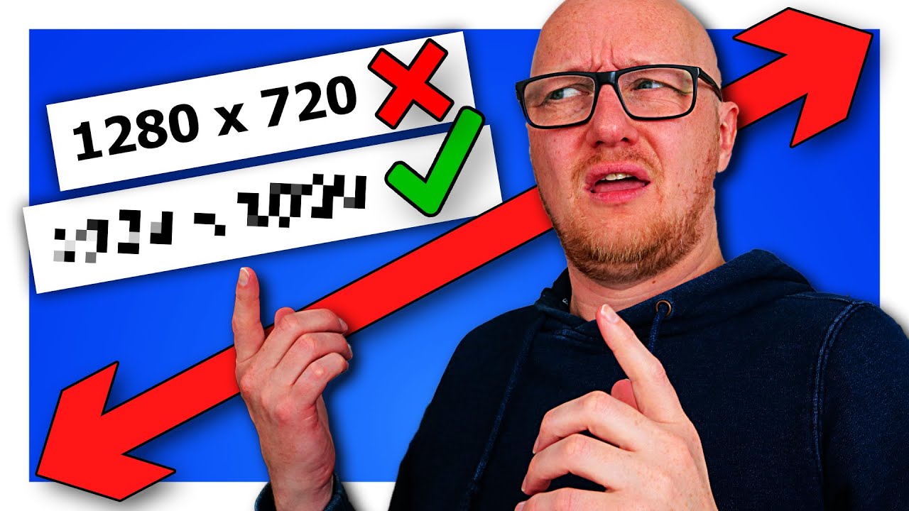 Dexxter Clark
Advantages of custom-made thumbnail designs
An effective thumbnail grabs a viewer's attention, helping increase both click-through rates (CTR) and video views. As a YouTube creator, you have the choice to use custom-made thumbnail designs or simply rely on still frames extracted from your video. This section focuses on understanding the differences between the two approaches and the advantages of using custom-made thumbnail designs.
Custom-Made Thumbnails vs Still Frames
A custom-made thumbnail is a purposefully designed image that represents your video, typically following brand guidelines and incorporating elements such as text and icons. In contrast, a still frame is a single frame extracted from the video itself by YouTube. Custom-made thumbnails are more likely to capture a viewer's attention and convey the essence of your content, whereas still frames may not always be the most visually appealing or representative of your video content.
Advantages of Custom-Made Thumbnails
-
Increased CTR: According to YouTube, custom thumbnails can improve a video's click-through rate by up to 154%. Having an attractive thumbnail encourages viewers to click and watch your video.
-
Improved Visual Aesthetics: Custom-made thumbnails typically feature vibrant colors, visually-appealing fonts, and a high-quality design that better reflects the content and messaging of your video.
-
Better Branding and Consistency: By designing custom thumbnails that follow your channel's branding style and guidelines, viewers can easily identify your videos among other search results, helping create a recognizable brand presence on YouTube.
-
Greater Control: You have the freedom to create a custom thumbnail that properly showcases your content, avoiding those awkward or unflattering still frames generated automatically by YouTube.
-
Optimized for Multiple Platforms: Custom-made thumbnails can be optimized for display on different devices and platforms, ensuring a consistent viewing experience across various screens.
- Do create custom thumbnails with the suggested resolution of 1280x720 pixels and a 16:9 aspect ratio.
- Don't use clickbait or misleading thumbnails, as YouTube may penalize your video's ranking.
- Do include relevant text and keywords to provide more context for your content.
- Don't overcrowd your thumbnail design with too much information, as this can reduce its visual appeal.
- Do follow your channel's style guide and branding, ensuring a consistent look.
Optimizing your thumbnail design can dramatically improve your CTR and video views. Consider using thumbnail designers or resources such as Canva, Adobe Spark, and Fotor to create custom thumbnails that stand out from the competition. You can also take inspiration from other successful YouTube creators and research design trends within your niche.
Moreover, if you're new to creating YouTube videos, you might find how to make YouTube videos helpful, which offers guidance on video production and choosing the right equipment.
By understanding the advantages of custom-made thumbnail designs, you can create visually appealing and effective thumbnails that help increase your video's reach, engagement, and overall success on YouTube.
Common pitfalls of using auto-generated still frames
Auto-generated still frames, while they may seem like an easy option for creating thumbnails, often lead to several issues and pitfalls that can negatively affect your video's click-through rate (CTR), viewer engagement, and overall success. Here are the common pitfalls associated with using auto-generated still frames and some tips on how to avoid them.
Auto-generated still frames can often be blurry, poorly lit, or poorly composed. These low-quality images can cause viewers to perceive your video as amateurish or uninteresting. To avoid this, it's best to create custom thumbnails that are eye-catching and visually appealing, showcasing the main subject or theme of your video.
Unrelated to the video content
Sometimes, auto-generated still frames may not accurately represent the content of your video. This can cause confusion and lead viewers to believe that the video is not relevant to their interests. Always choose or design a thumbnail that highlights the main point or essence of your video.
Lack of text or branding
Incorporating text and branding within your video thumbnail can help it stand out and communicate your message more clearly. Auto-generated still frames usually lack these elements, which may result in a missed opportunity to grab the viewer's attention and encourage them to click on your video. Be sure to include text and branding elements in your custom thumbnail.
Poor CTR
As mentioned earlier, using auto-generated still frames may lead to decreased click-through rates. This low engagement can negatively impact your video's performance in the YouTube algorithm, making it more challenging for your content to reach new viewers. By designing custom thumbnails that clearly and effectively convey the content of your video, you can increase your CTR and boost the visibility of your videos.
Inconsistency in thumbnail styles
Establishing a consistent thumbnail style can help build brand recognition and create a cohesive look for your YouTube channel. When you rely on auto-generated still frames, your thumbnails will lack consistency and may appear disjointed, making it more difficult for viewers to recognize your videos and follow your content. Design your thumbnails with a consistent theme or style, using similar colors, fonts, and layout elements to create a visual identity that complements your brand.
To improve your thumbnails and avoid these pitfalls, consider learning how to make YouTube videos and optimize your video thumbnails for better performance. Taking the time to create custom, attractive, and relevant thumbnails is an investment that can pay off in increased views, engagement, and growth for your YouTube channel.
YouTube Thumbnail Designers
- Importance of Thumbnail Design for YouTube Videos
- Thumbnails should be visually appealing
- Text and typography
- Consistency and branding
- Optimize for various devices
- Avoid clickbait and misleading information
YouTube Thumbnail Designers
Importance of Thumbnail Design for YouTube Videos
Thumbnails are the first impression viewers have of a video and can significantly affect a YouTube channel's performance. High-quality, attention-grabbing thumbnails can lead to increased click-through rates (CTR), views, and overall channel growth. In contrast, poor thumbnail designs can result in missed opportunities as viewers scroll past the video without giving it a chance.
- 90% of top-performing videos on YouTube use a custom thumbnail source
- With increased CTR, views can increase by up to 25% source
| Do's | Don'ts |
|---|---|
| Use high-resolution images | Don't use blurry or pixelated images |
| Include concise and easy-to-read text | Don't clutter the thumbnail with too much text |
| Utilize contrasting colors for better visibility | Don't use low contrast or monochromatic color schemes |
| Show human emotions and facial expressions | Don't use emotionless stock photos |
| Consider A/B testing thumbnail variations | Don't rely on generic, autogenerated thumbnails |
Ideal Thumbnail Dimensions
| Resolution | Aspect Ratio | File Size Limit |
|---|---|---|
| 1280 x 720 px | 16:9 | 2 MB |
To learn more about creating engaging content for YouTube, check out our guide on how to make YouTube videos.
Principles of Effective Thumbnail Design
Thumbnails should be visually appealing
An eye-catching thumbnail should include high-quality images, bold colors, and strong contrasts. Focus on creating a visually appealing and balanced composition, using a combination of photography, graphics, and text. Avoid clutter and make sure the elements within the thumbnail do not compete for attention – your thumbnail should tell a clear and concise visual story.
Text and typography
Text can be a helpful element of thumbnail design when used sparingly and effectively. Keep text short, relevant, and easily readable within the small scale of a thumbnail. Make sure the font choice and size are legible on different devices, and consider using text overlays or contrasting colors to ensure readability. Keep in mind that the video title will be displayed below the thumbnail, so avoid using redundant or repetitive information.
Consistency and branding
Consistency in design and branding can help strengthen your channel's identity and make your videos easily identifiable to your subscribers. Establish a specific thumbnail design style or template that can be adapted to different videos while maintaining your brand's unique visual language. Including a logo, watermark, or consistent use of colors and style can also enhance brand recognition.
Optimize for various devices
Ensure that your thumbnail is visually appealing and easily readable on desktop computers, mobile devices, and tablets. Check the design's appearance at different scales, and if necessary, use larger text and bolder graphics to ensure legibility on small screens.
Avoid clickbait and misleading information
While it's important to create an engaging thumbnail, avoid using clickbait strategies that mislead viewers or make false promises. Doing so can lead to negative feedback, low viewer retention rates, and less trust in your content. Instead, focus on delivering valuable information and an accurate visual representation of the video's content.
To further improve your skills in YouTube content creation and thumbnail design, consider checking out some online courses and resources available on how to make YouTube videos.
YouTube Thumbnail Designers An Essential Part of Video Production

 vidIQ
vidIQ
YouTube Thumbnail Designers An Essential Part of Video Production
The role of thumbnail designers in YouTube marketing
Thumbnails and YouTube Algorithm
The YouTube algorithm takes into account various factors when recommending videos to users, one of which is CTR. A high CTR indicates that a video is enticing to users and therefore worth promoting on the platform. According to YouTube, half of all channels and videos on YouTube have an impression CTR between 2% and 10%. Optimizing your thumbnail design is crucial for increasing CTR and enhancing your video presence.
Essential Elements of Compelling Thumbnails
- Visibility: Thumbnails should be designed with high contrast and bright colors to catch a viewer's attention.
- Clarity: The thumbnail must be clear and easily understood even in smaller sizes (e.g., when viewed on a smartphone). Avoid using tiny text or complicated visuals.
- Relevance: The design should accurately represent the content of the video. Misleading thumbnails can result in lower audience retention rates and a negative impact on your channel's performance.
- Branding consistency: Your thumbnail design should be cohesive with your channel's overall branding to help users easily recognize your content.
Do's
- Use high-quality images and text that can be easily read even in smaller sizes.
- Prioritize strong visual elements, such as faces, to capture a user's attention.
- Test different versions of thumbnails to see which is most effective in driving traffic.
- Incorporate your branding in your thumbnail design.
Don'ts
- Don't use misleading thumbnail designs that will disappoint or frustrate viewers.
- Avoid obscuring essential elements with the video's timestamp, as YouTube displays this in the bottom right corner.
- Don't forget to design for all devices, as more than 70% of YouTube watch time comes from mobile devices.
- Avoid overloading your thumbnail with text or intricate details that are difficult to see in smaller displays.
Thumbnail Designers for Hire
Hiring a professional thumbnail designer can be essential, especially for those who lack the skills or resources to create eye-catching and effective thumbnails. Thumbnail designers can help you increase your CTR, drive more traffic to your videos, and ultimately grow your YouTube channel.
Thumbnail designers play a crucial role in YouTube marketing and their impact on your channel's performance should not be overlooked. By optimizing your thumbnail design, you can significantly increase your video's CTR, boost its visibility on the platform, and grow your audience. If you are serious about your YouTube career, consider hiring a professional thumbnail designer or learning how to make YouTube videos and create compelling visuals yourself.
YouTube Thumbnail Designers An Essential Part of Video Production
Eye-catching visuals
To understand what makes a thumbnail stand out, let's first look at some statistics:
- 90% of the best-performing videos on YouTube have custom thumbnails.
- High-quality and colorful thumbnails achieve higher click-through rates (CTR).
- As humans, we process images 60,000 times faster than text.
These stats reveal that investing in high-quality, custom thumbnail design can significantly boost your video's performance. An eye-catching thumbnail increases the chances of your video being noticed and clicked on in the crowded YouTube space. To design effective thumbnails, consider the following:
- Use high-contrast images: High-contrast images are easier to recognize and more visually appealing.
- Include faces: Humans are naturally drawn to faces, especially facial expressions that show strong emotions.
- Incorporate vibrant colors: Colors provoke emotions and can help set the tone for your video.
- Choose legible fonts and text size: Ensure your audience can quickly grasp the video's topic through readable text.
Thumbnails that accurately represent the content
Although an alluring thumbnail may initially entice users to click on your video, it's important that it accurately represents the content. Misleading thumbnails can lead to viewer drop-off and negatively impact your video's watch time, ultimately harming its performance on YouTube's algorithm.
To create effective thumbnails that truthfully represent your content, include relevant imagery and text that gives potential viewers a clear idea of what to expect from your video. For instance, if your video is a DIY tutorial, include images of the final product and step-by-step text to communicate the content accurately.
Consistent branding for easy recognition
Consistent branding across your thumbnails can help viewers recognize your content quickly and encourage brand loyalty. Developing a distinct style that you carry through all your thumbnails allows your audience to easily identify and distinguish your videos amid the sea of content. This stylistic consistency might include using specific colors, fonts, layouts, or recurring elements such as your logo or channel avatar.
A/B testing for continuous improvement
To further enhance your thumbnail design, experiment with A/B testing. By creating multiple thumbnail variations for each video and monitoring their performance, you can gather data on what design elements resonate with your audience the most. This can help you refine your thumbnail design approach and improve your CTR over time.
For overall improvement in your YouTube video creation process, check out our article on how to make YouTube videos for in-depth guidance and resources.
Looking for Brand Deals or Channel Strategy?
We run a platform for brand deals and an agency, helping creators derive maximum value from their content, while offering brands access to unparalleled, best-in-class research.
For Creators
- Strategic Brand Connections
- Outreach to Old Sponsors
- Platform to Manage Brand Deals
- View-Based Contract Negotiation
- Comprehensive Channel Strategy
- Channel/Thumbnail Optimization
For Brands
- Tools to Shortlist Creators
- Targeted Creator Outreach
- Detailed Sponsorship Reports on Existing Brands
- Platform to Manage Creator Deals
- View-Based Deal Facilitation
Apply to work with us or email [email protected]

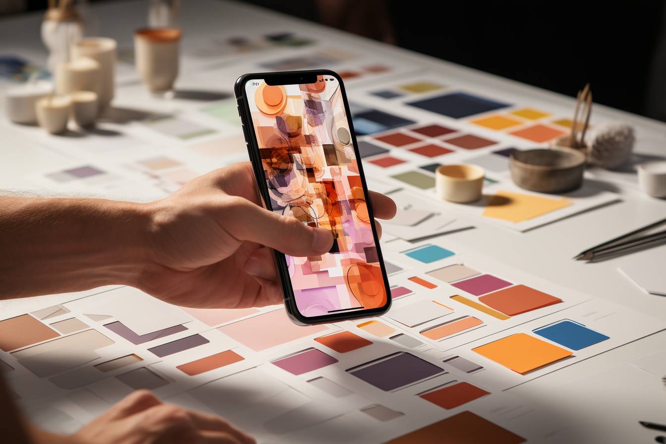
Table of Contents
Work with us